
PROJECT OVERVIEW
A design system is a collection of reusable components, guided by clear standards, that can be assembled together to build any number of web pages or applications.
I created the design system for Logan Hollowell to bring order and clarity to the design process.
In this project you will see some of the components I built for this design system, but a design system is much more than just a component set.
RESULTS
Design systems are complex and are like a living organism in that they are ever evolving.
What I show below is a selection of what goes into a complete design system.
A complete design system generally contains the following:
Documentation: A shared space where you say how to use the design system. Currently this is composed in Notion.
Visual Language: Guide to what the brand feels like. We had an old version, which I refined further.
Pattern Library: Also called a component library includes what you see below.
Brand Guidelines: This includes principles, tone, voice, writing style, and more.
CSS GUIDELINES: Many of these components and also have custom CSS guidelines.
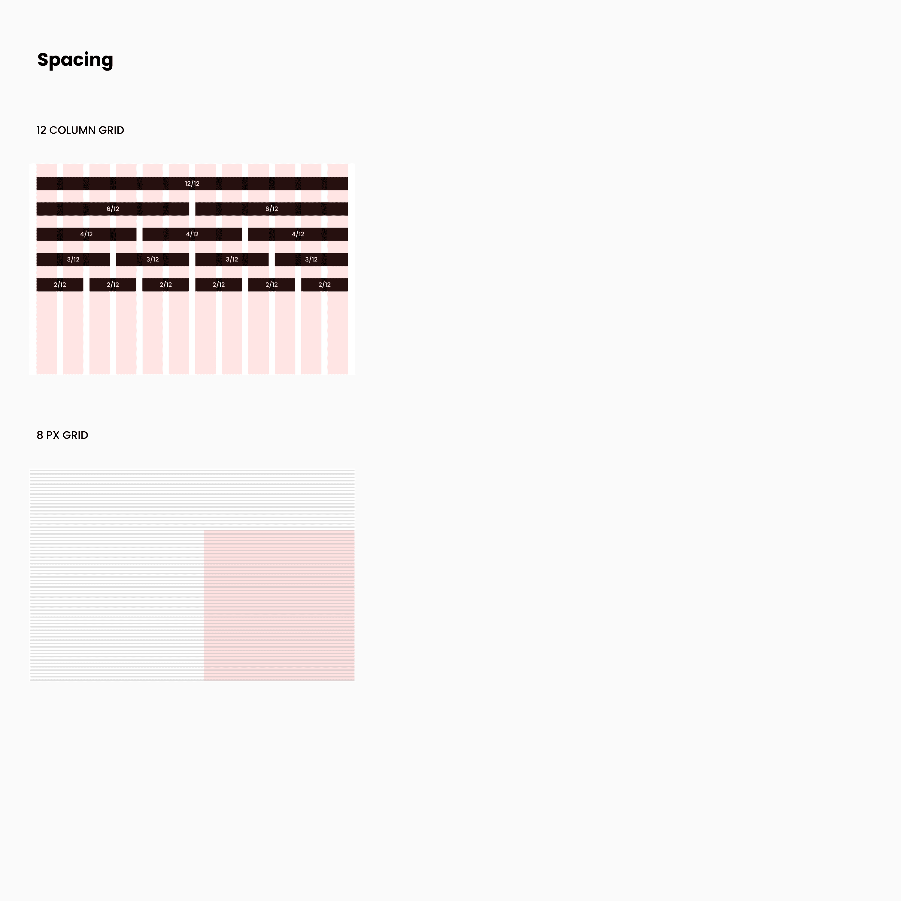
SPACING AND GRIDS
You don't start building a house without it's foundation, and the same applies to a design system.
I went with an 8 PT grid system that consists of a 12 column grid and an 8 PX baseline grid. The reason why I went with an 8 PT system is to help the design system be more responsive because all of the top screen sizes are divisible by 8 on at-least one axis.
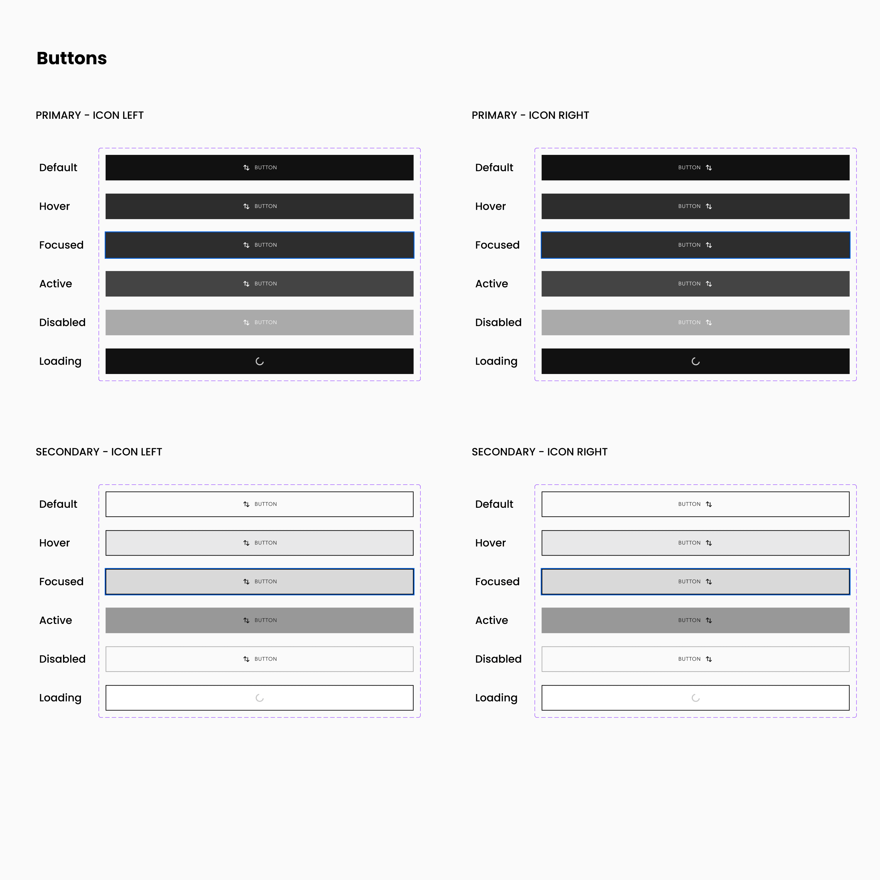
BUTTONS
We all are familiar with buttons, but what many non-designers fail to realize is a single button will have several different states. The most common being active, hover, focus, and disabled. You will also occasionally see a loading state.
I decided to use all 6 of these states, along with 5 different button types. Those types include: Primary, Secondary, Primary - Small, Secondary - Small, and Icon Only. The primary and secondary button states also have icon states as well.

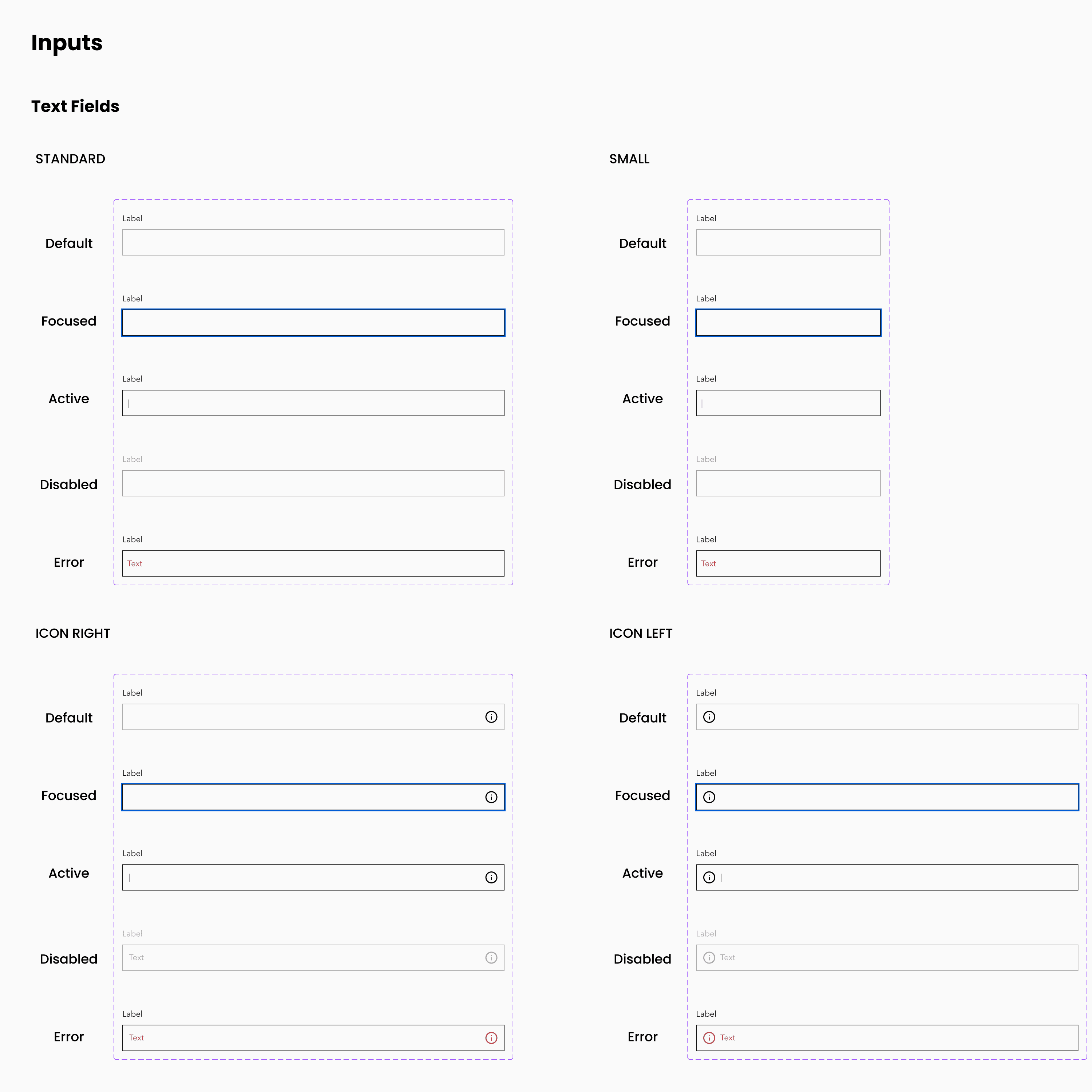
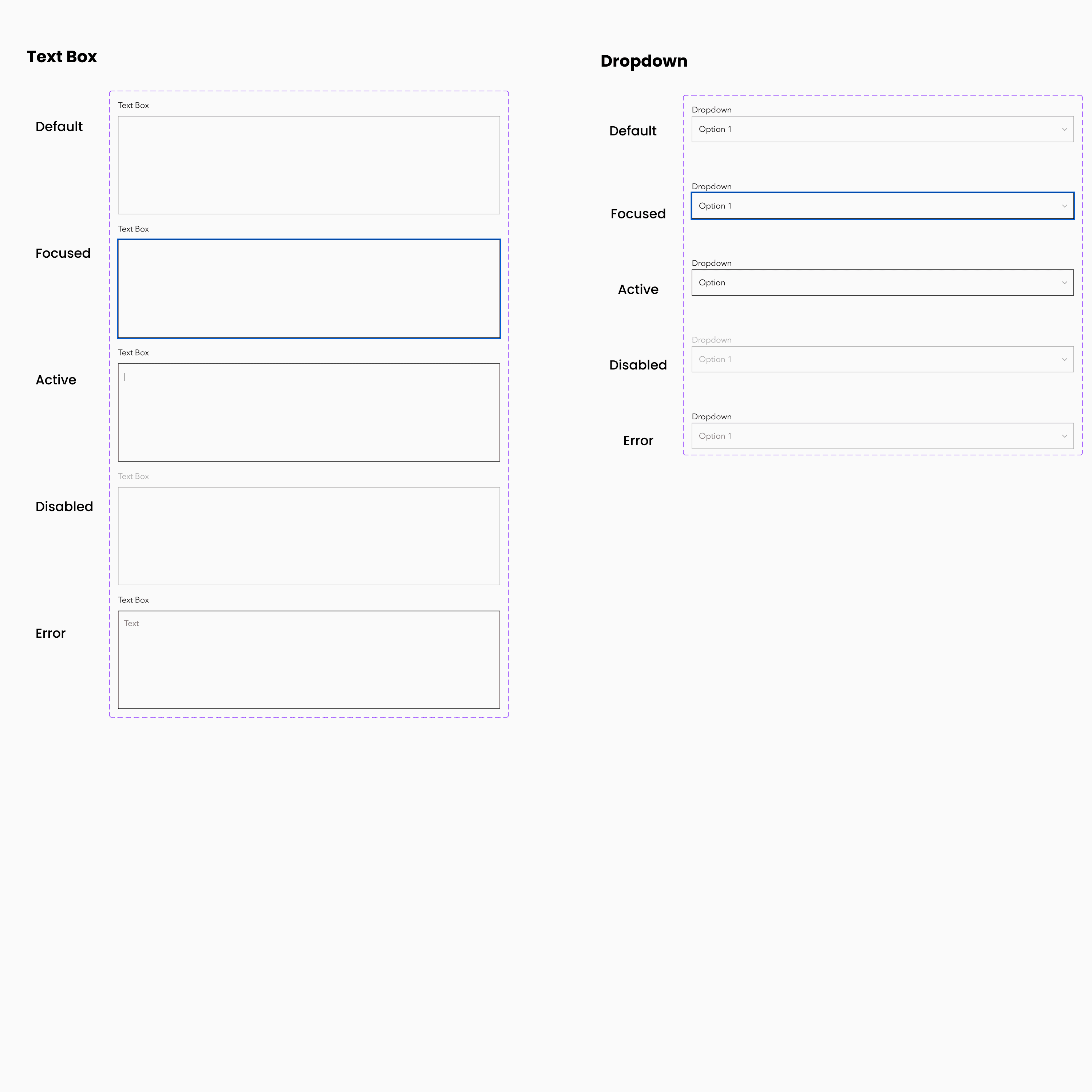
INPUTS
One of the other big category of components is the form fields or inputs. These need to accommodate several different states as well. One of the biggest things I try to keep in mind when designing form fields is accessibility.

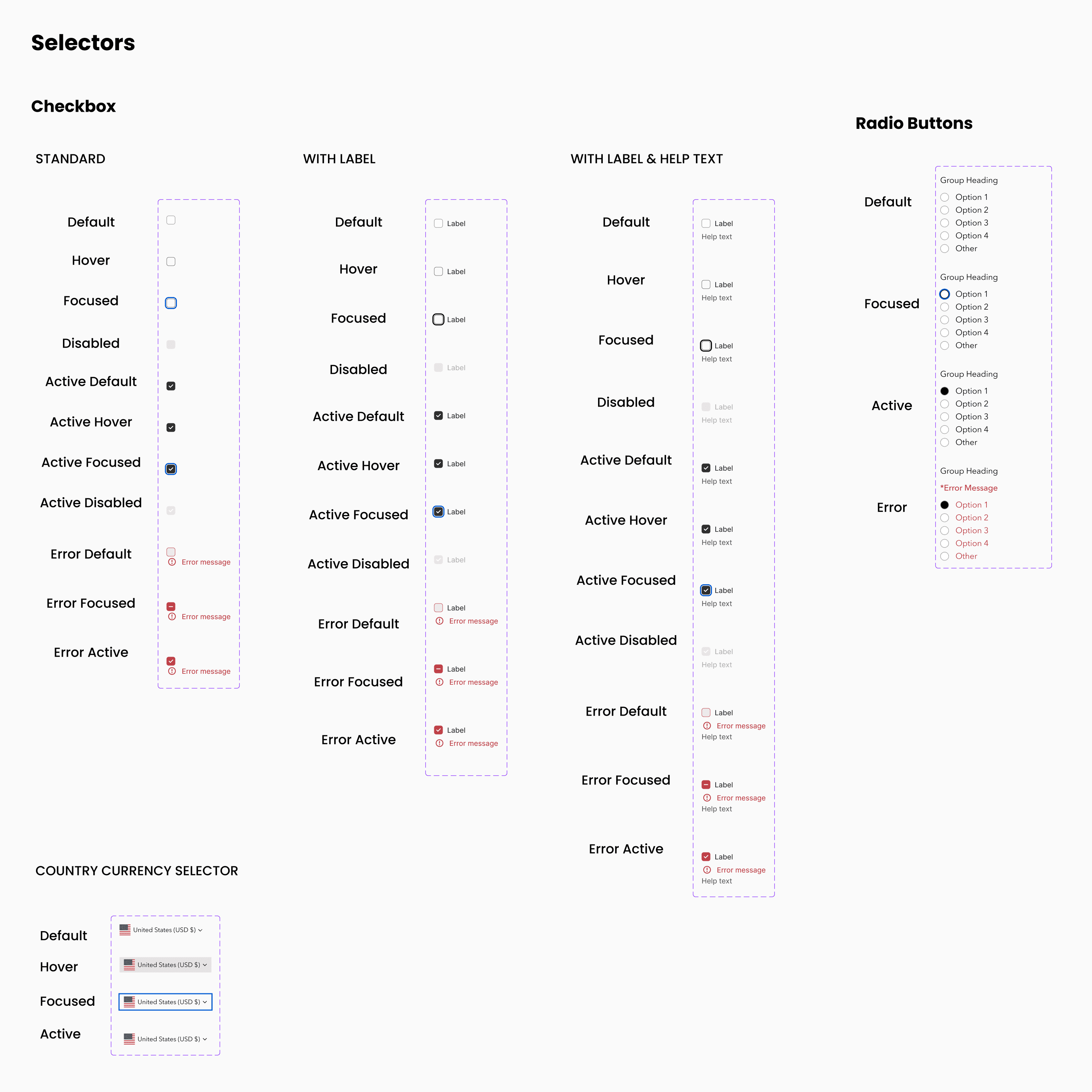
SELECTORS
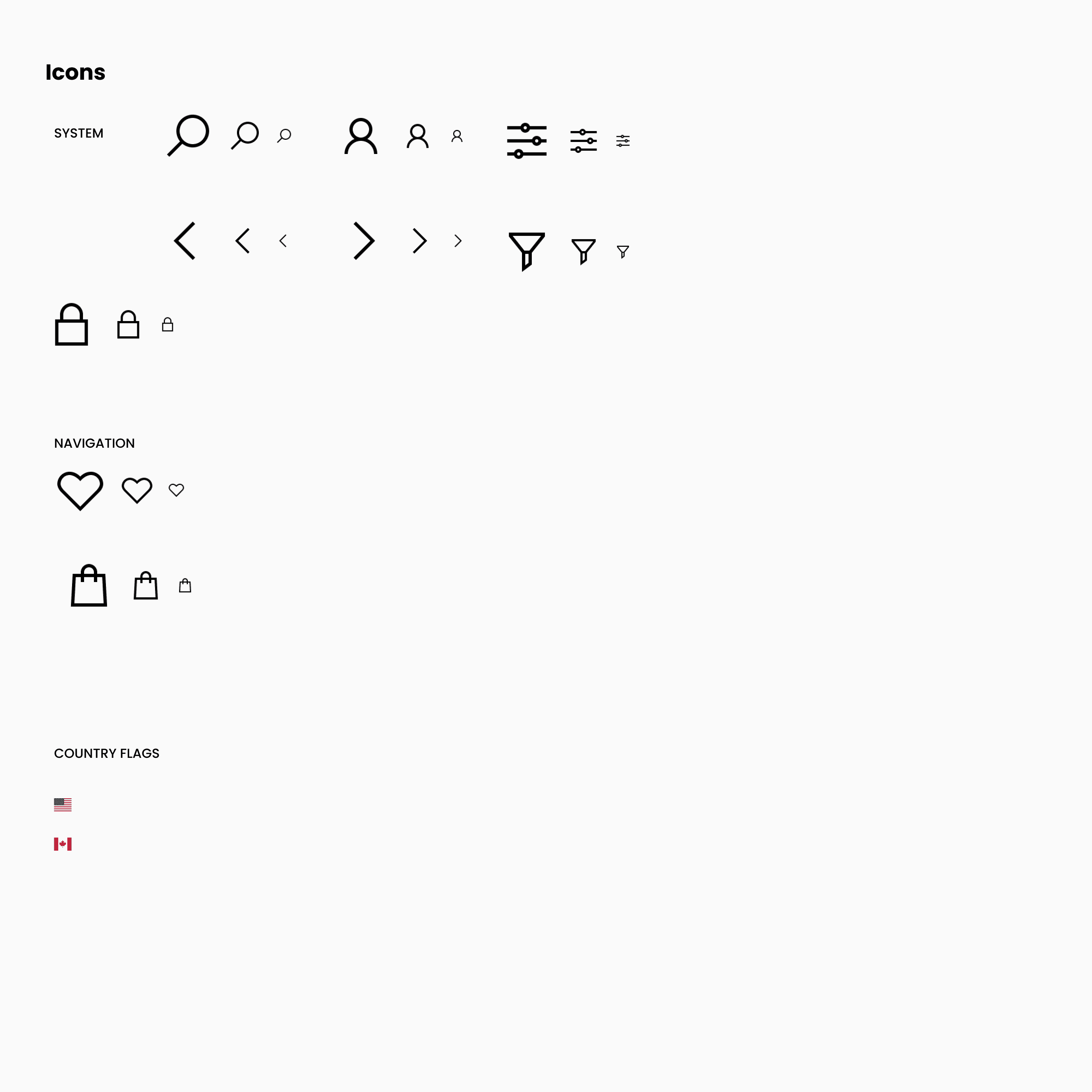
iconOGRAPHY
Iconography uses SVGs from Font Awesome.
The default .ICON class uses the realtive EM unit and is ideal for using icons inline with text, adapting the icon size to the font size of the parent element. The icon can easily sit before or after text using spacing.
Below is a small sampling of the icons used.
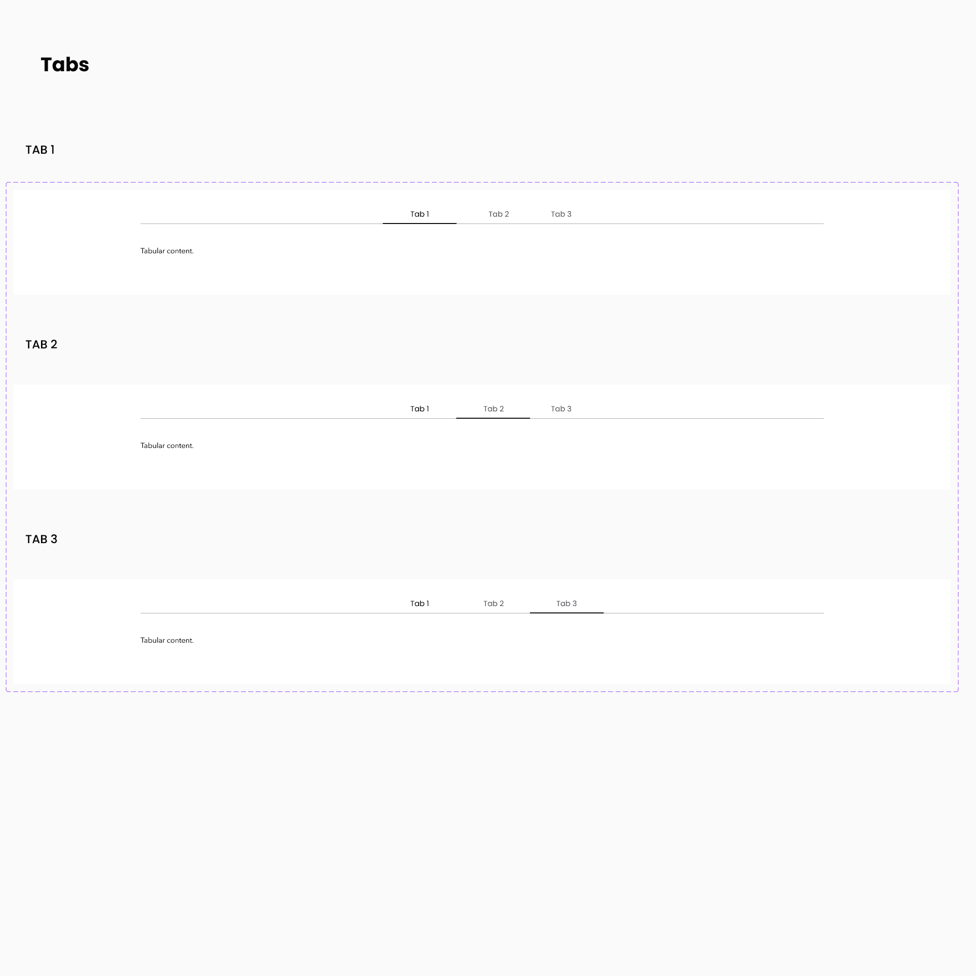
TABS
We utilize tabs mostly on product pages to differentiate between important information.
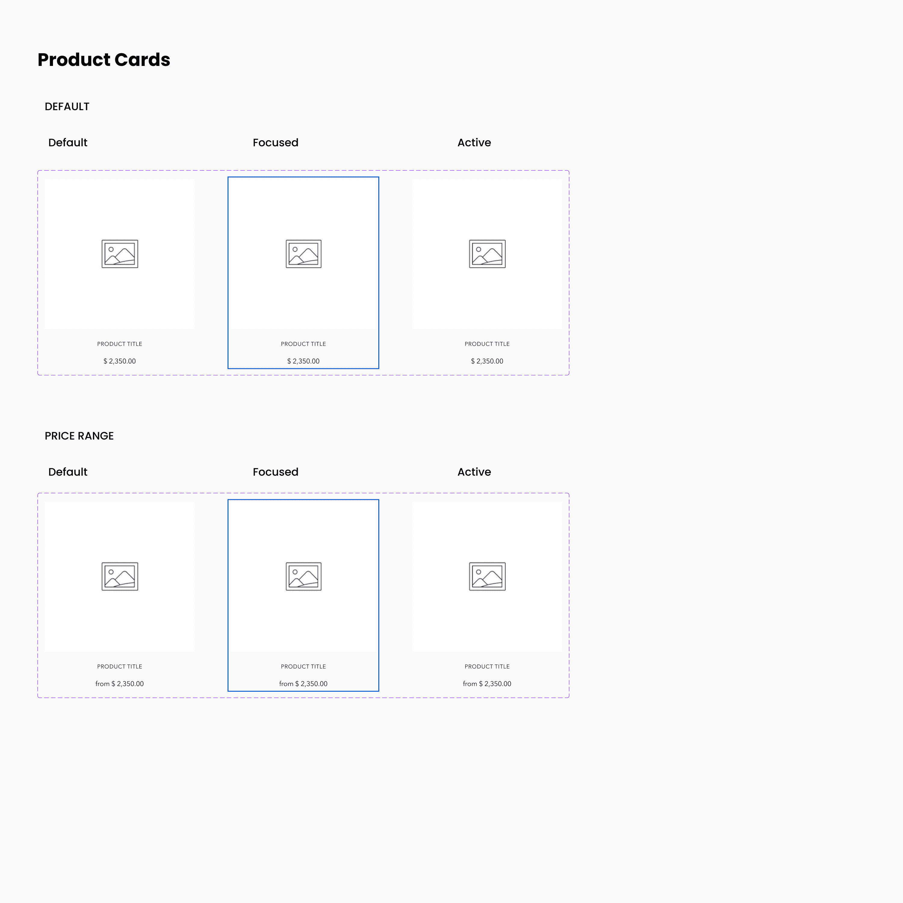
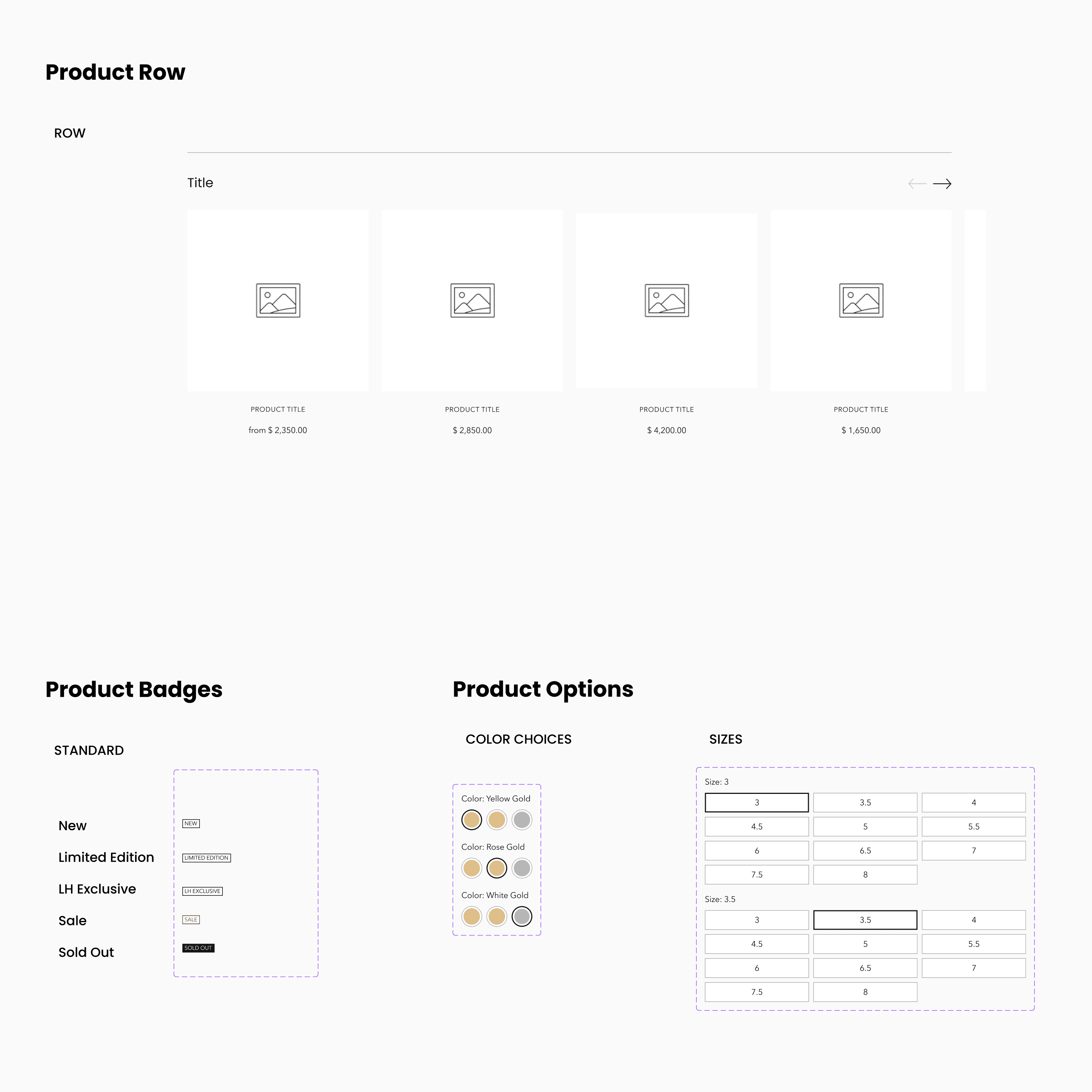
product cards and options
Product Cards, Product Options, and Product Badges are featured here. Often these are in category pages or in product pages specifically.
headers
We utilize two types of headers. One is default and the other one is hover.

toggle and tooltips

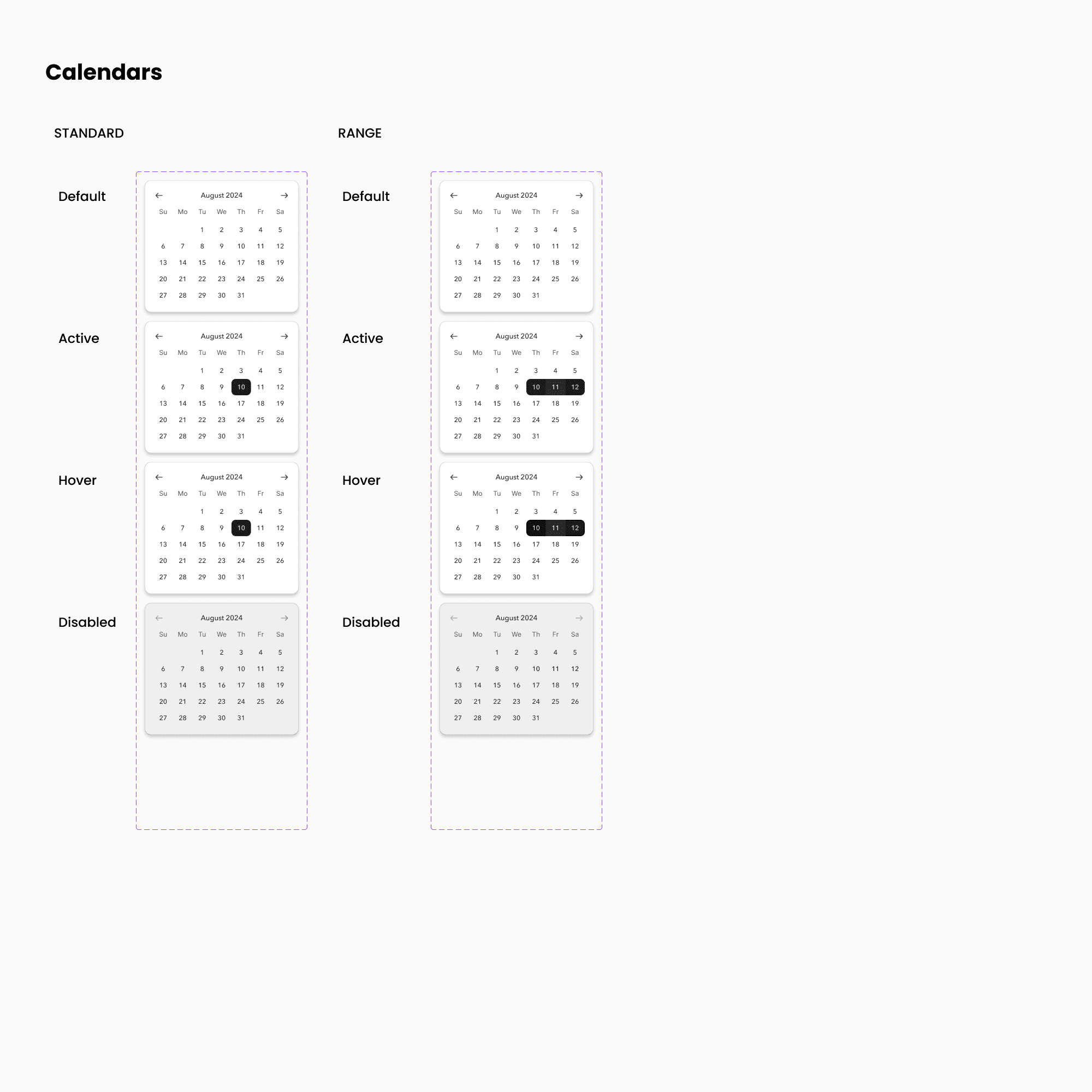
CALENDARS
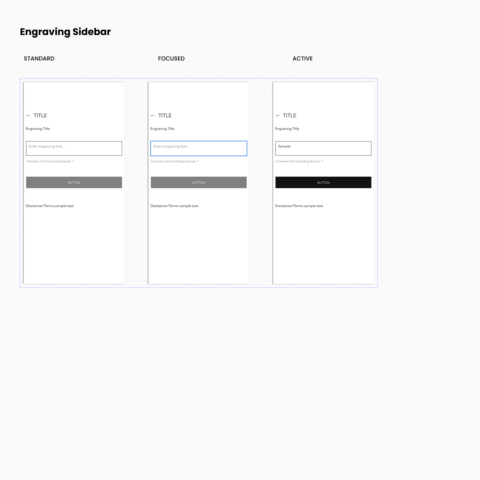
ENGRAVING SIDEBAR
This sidebar combines components, using the Headings, Buttons, and Input Fields.
COLORS
We utilize many shades of dark grey along with a few other colors.
Below is a sample of the dark grey used.

TYPOGRAPHY
For typography we mainly utilize Avenir Next, as well as a few other secondary fonts.
