Case study — Design Systems
Logan Hollowell
Design System
Turning a one-off redesign into a living system — tokens, components, and guidelines that keep every digital touchpoint unmistakably Logan Hollowell.

The challenge
The website redesign proved what the brand could feel like online. The problem: every new page, campaign, and seasonal drop risked eroding it.
Marketing built landing pages under deadline pressure, developers improvised spacing and type decisions, and small inconsistencies compounded — buttons that almost matched, headings that almost aligned, product cards that almost felt right. For a luxury brand, "almost" is the difference between premium and ordinary.
My brief: codify the redesign into a system that non-designers could build with confidently — without flattening the brand's celestial character into a generic kit.
The approach
01
Audit everything
I inventoried every component, color, and type style across the storefront, email templates, and campaign pages. The audit surfaced dozens of near-duplicate buttons and heading styles — visible proof of the drift, and a clear scope for consolidation.
02
Architect the tokens
Color, type, spacing, and radii were distilled into a semantic token layer — names that describe intent, not appearance — so a seasonal palette refresh becomes a token swap, not a redesign.
03
Build the component library
A Figma library of production-matched components — navigation, product cards, editorial blocks, forms, checkout elements — each with variants, interaction states, and responsive behavior built in, mirrored one-to-one in the Shopify theme.
04
Document for non-designers
Guidelines written for the people actually assembling pages — marketers and developers — covering when to use each pattern, how to compose campaign pages, and the brand rules that should never bend.
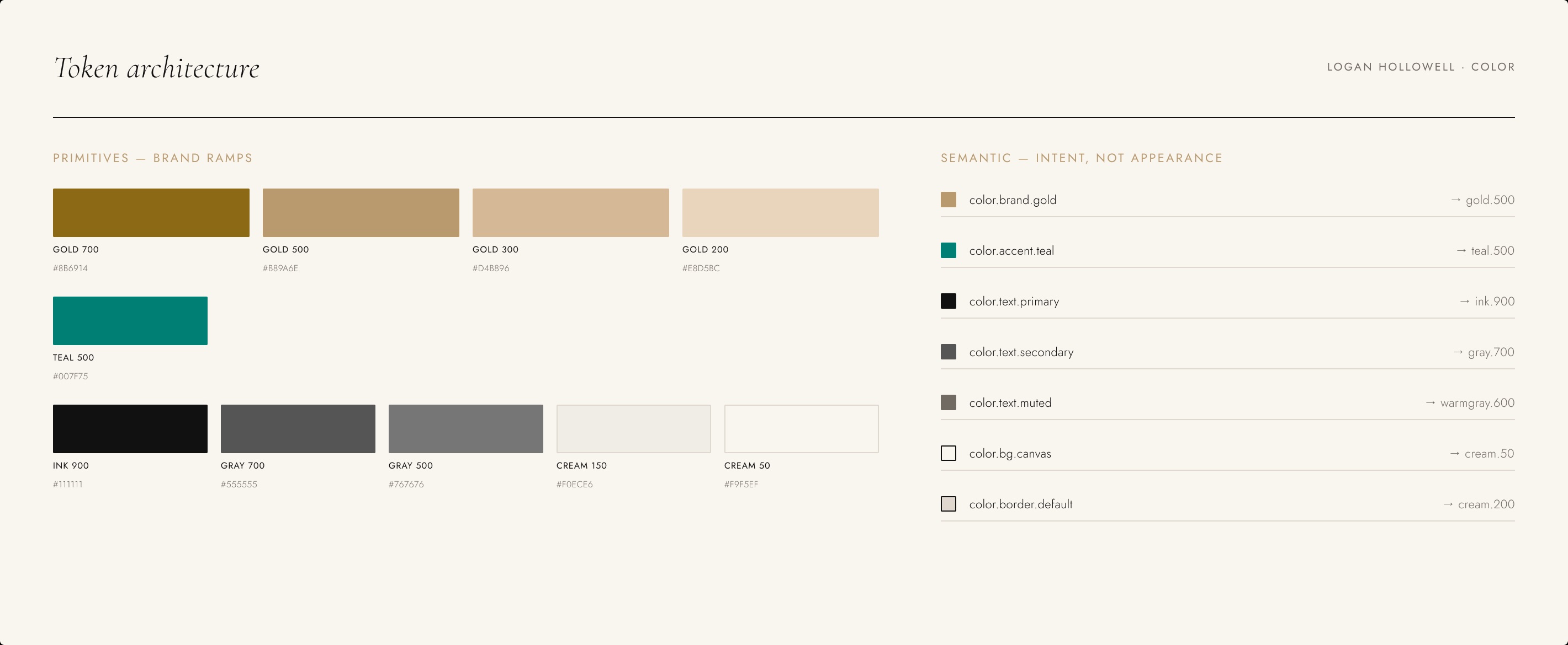
Token architecture

Component variants
"A design system for a luxury brand has one job: make the hundredth page feel as considered as the first."
— Design principle for the project
The outcome
A single source of truth that lets a small team ship campaign pages at retail speed — without diluting a luxury brand.
- A semantic token architecture spanning color, type, spacing, and radii
- A production-matched Figma component library with variants and states
- Plain-language documentation written for marketers and developers
- Campaign pages assembled from system patterns instead of one-off builds — see where it started in case study 01
Detailed adoption and velocity figures available on request.