Chris Terterian

Detroit, MILos Angeles, CA

← All work

Case study · E-commerce and community

Website, 2026
  • Design
  • Build
Role

Product Designer (Solo)

Scope

Design, front end, back end

Platform

Figma, Shopify, Database

Team

The store’s owners

Problem

A store for new parents ran on a stock theme, with apps from the Shopify app store for its registry. Each app had its own style and limitations.

What I did

Designed the store, then built it: the front end, the design system, and the app behind the registry and the community.

Status

Live at thecleanbean.com.

Video · Set an age or due date and the information changes, along with product recommendations across the site

Where I had to make the case

Shipping to the parents

Sending a gift straight to the parents shows their address to the buyer. The store’s plan cannot hide it safely, so we made it opt-in.

The bottom tab bar

I prototyped it first. User interviews showed parents wanted every option, and search, in one place, so it was removed before launch. Section 04 has the rest.

Every feature looked like a different shop.

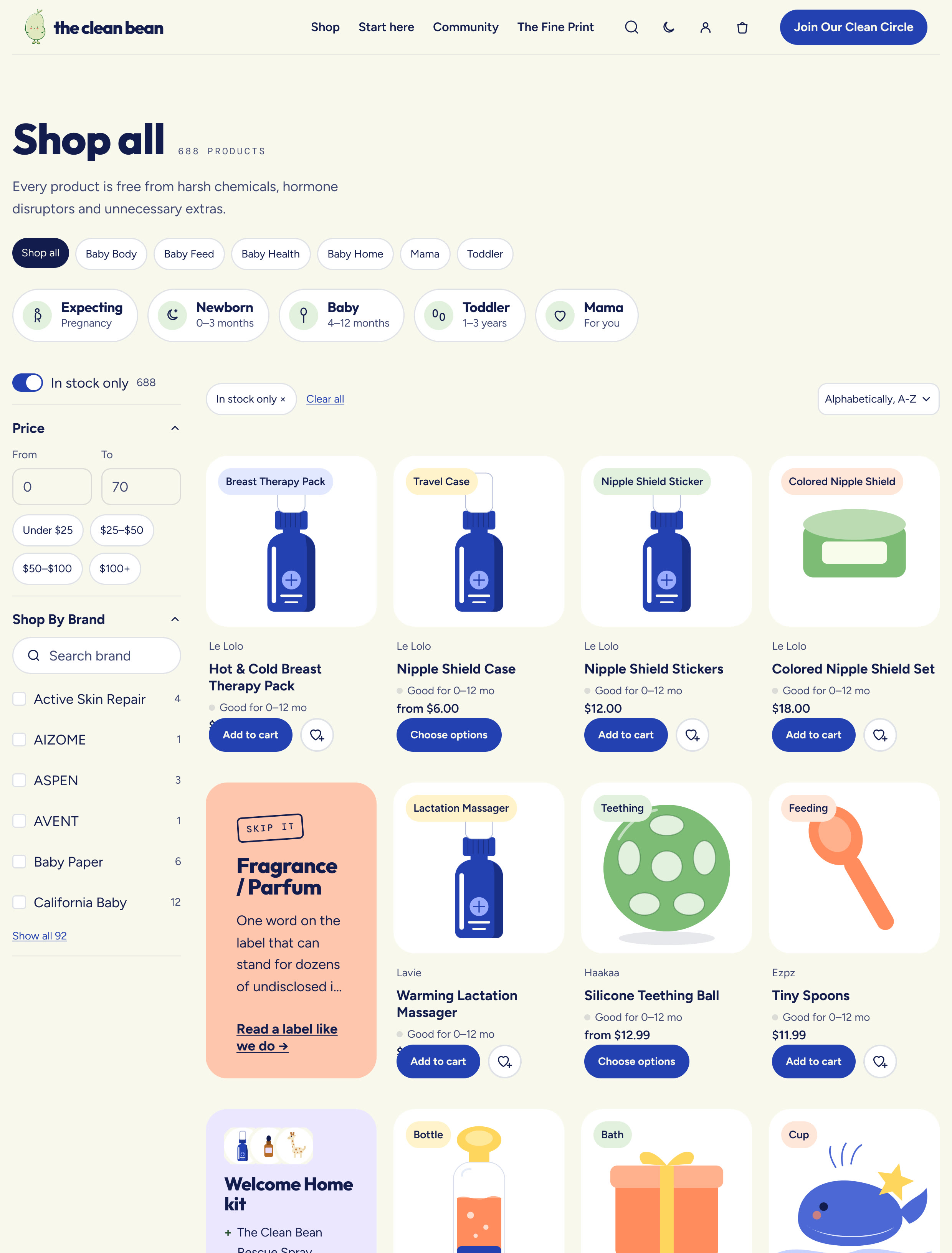
The Clean Bean sells safe baby essentials to new and expecting parents. The registry and wish lists came from apps from the Shopify app store, each with its own style, its own limitations and its own account, at the moment parents were being asked to trust the store most.

  • Missing

    A registry that belonged to the store

    The app’s version looked and behaved like a separate site.

  • Missing

    Guidance by age

    Nothing said what matters at four months versus two years.

  • Missing

    A reason to come back

    There was no place for parents to meet between purchases.

Three people use this store, and they want different things.

  • Parents

    What matters for my child right now?

    They shop by age and stage, not by product category.

  • Gift givers

    What is still needed, without spoiling it?

    They need the list, and the parents need the surprise.

  • The owners

    Run it without a developer.

    Events, community posts and registries all have to be managed from the store’s own admin.

Four parts of the store, designed and built from scratch.

Decision 01

A registry in four questions.

The builder asks four questions and returns a list sorted into must-haves, nice-to-haves and things to skip. Guests see what is still needed. Gifts stay hidden from the parents until they choose to look.

Replaces a Shopify app
Why

A registry is where expecting parents spend the most time, and the app’s version looked like another shop. Asking four questions gives a parent something useful before the store asks for an account. They sign up to keep the list, not to see it.

Video · Four questions, then a sorted list
The registry page showing what is still needed
Registry page: what is still needed, and surprise mode explained up front
Decision 02

One account for everything a parent does here.

My Bean Circle holds the registry, the gatherings a parent is going to or hosting, their swaps and their questions. A baby’s age can be saved without signing in, and stays in that browser.

Why

A stock store account is a list of orders. A parent here also has a registry, RSVPs and questions waiting on answers, so the account had to hold those. Keeping the age in the browser means the store can be useful before anyone has decided to trust it with an email.

My Bean Circle, the account page
My Bean Circle, signed out: what it holds, and the age prompt that needs no account
Decision 03

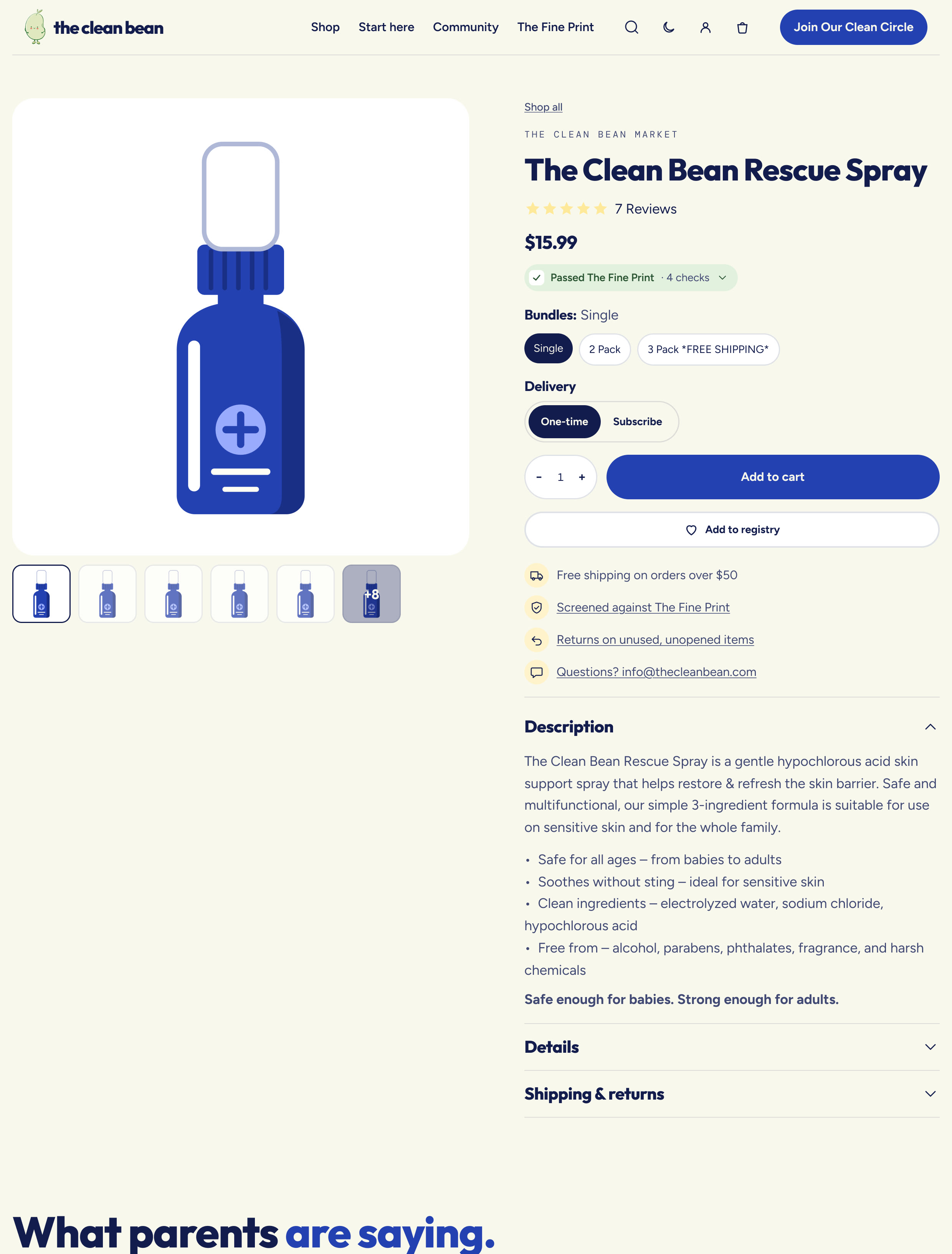
Product pages that answer age and ingredients first.

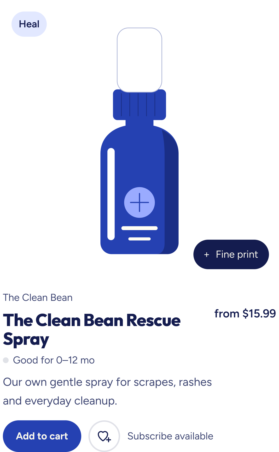
Each product shows the age range it suits and whether it passed The Fine Print, the store’s ingredient screen. Both sit above the buy button, and the label opens to show each check. Add to registry sits beside add to cart.

Why

A parent’s first two questions are whether this suits their child’s age and what is in it. Price comes third. Putting both answers above the button means nobody has to scroll to a description to decide.

Video · The Fine Print label opens, then the product is added to the cart
Decision 04

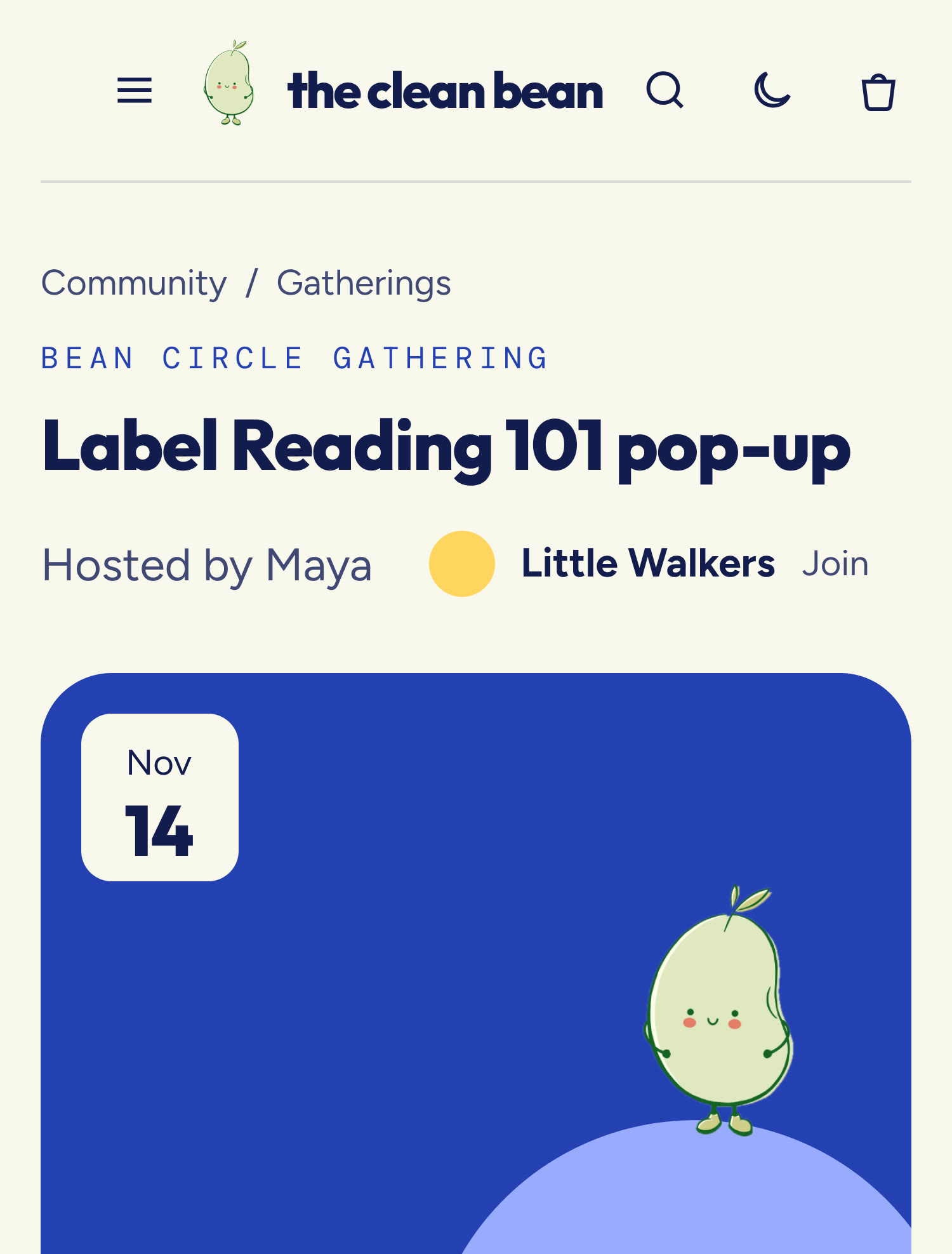
Gatherings that staff run and parents can host.

Each gathering has its own page with a date, a map link, an RSVP and ways to invite a friend. Any parent can propose one in four steps. Staff check every proposal before it goes on the calendar.

Why

The owners wanted the store to be a place parents return to between purchases, and they needed to run it themselves. Staff publish events from the store’s admin with no developer involved, and nothing a parent submits appears until someone has read it.

Video · A gathering page
The four-step form for hosting a gathering
Host a gathering: four steps, with ideas to start from
Community section
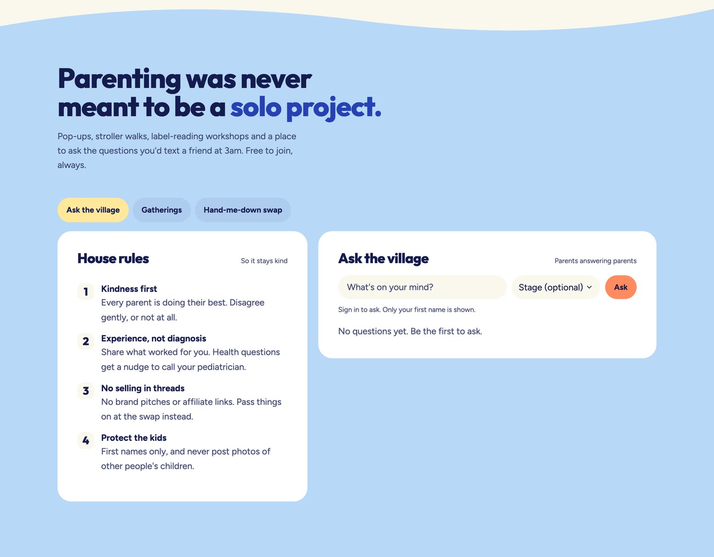
Community, with house rules beside the question box
Night mode
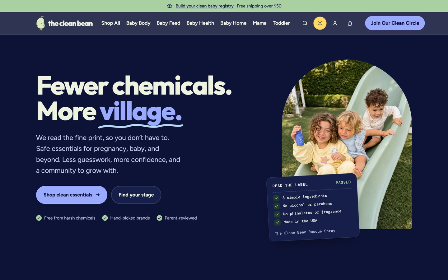
Night mode, for 3am feeds
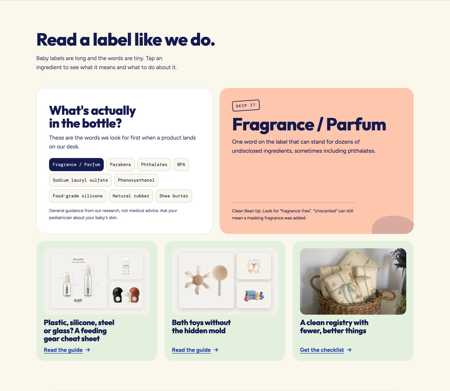
Read a label like we do
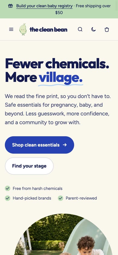
Home on a phone
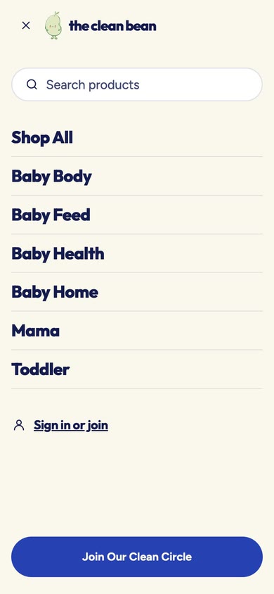
Menu drawer open on a phone
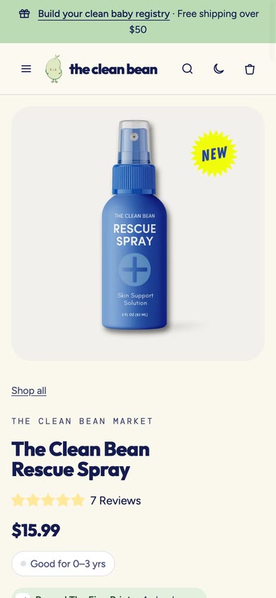
Product page on a phone
Phone: home, the menu drawer, and a product page

Four things that were designed, or built, and then cut.

  • A bottom tab bar on phones

    I prototyped a bottom tab bar first, assuming parents would use it. User interviews showed they wanted every option, and search, in one place. The tab bar was removed before launch.

  • Hiding the parents’ address at checkout

    The store’s current Shopify plan does not support this. Shipping to the parents is now opt-in at checkout.

  • Open posting behind a CAPTCHA

    It stops bots, but not bad advice. Staff approve every question, answer and swap listing before it appears.

  • A bouncy cart drawer

    It felt playful in a prototype and tiring in use. Drawers now open and close on one plain curve.

Code is the source of truth.

There was no design system before this, only a stock theme. I built one from nothing: tokens, 55 components, 10 patterns and three page templates.

Design tokens live in one repository, build to CSS, and sync to the store’s theme by branch. The Figma file is updated from the same files, so the two cannot drift.

The registry and community run on a small app with its own database, reached through the store’s own address. Order events keep each registry’s counts current, including cancellations and refunds.

  1. 01 · GitHub

    Tokens

    One repository holds every value.

  2. 02 · Build

    CSS

    The tokens compile to the stylesheet.

  3. 03 · Store

    Theme

    The stylesheet syncs to the store’s theme by branch.

  4. 04 · Figma

    Design file

    Figma is updated from the same files.

20558 2424 1616
Width
205 = label + 2 × button/default/padding-x
Height
58 = 25.6 type/ui/button-16/line-height + 2 × button/default/padding-y
Padding
24 × 16 button/default/padding-x padding-y
Gap
10 button/default/gap
Radius
Pill button/radius
Fill
action/primary
Label
Figtree Bold 16 / 25.6 type/ui/button-16 text/on-action
One component, measured: the primary button. Every number is a token, not a typed value.
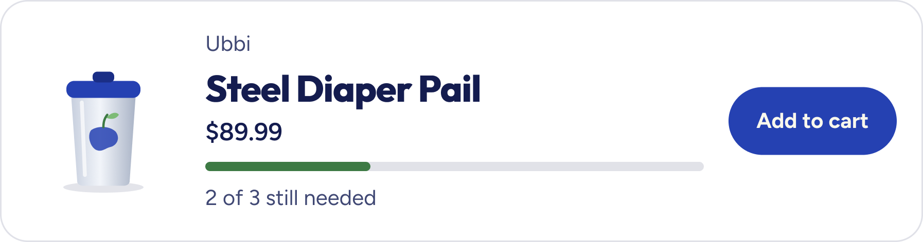
Product card component
Product card
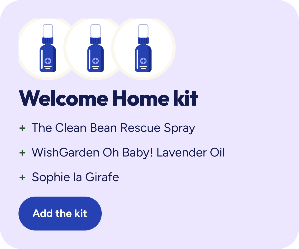
Kit card component
Card / Kit
Cart line item component
Cart / Line item
Registry item card component
Registry / Item card
Text field component
Form / Text field
Stage tab component
Toggle / Stage tab
Segmented control component
Toggle / Segmented control
Collection page template
Collection page
Product page template
Product page
Gathering page template on a phone
Gathering Page, Mobile
Video · The design system file in Figma: foundations, components, a pattern, and the page templates
  • Components

    55, in 389 variants

    Every property is bound to a token. No raw values.

  • Variables

    823

    Light and Dark, Desktop and Mobile. Ten motion patterns use them too, and nothing moves when the visitor asks for less motion.

  • Design to build

    Within 2 pixels

    Measured on the header at 1440 wide.

One storefront where shopping, the registry and the community share one look and one account.

The new site went live, and customers began making registries, attending events and leaving reviews. It also helps them make informed decisions about products.

Deciding the source of truth on day one.

We began with the design file leading and moved to code partway through. That meant redoing work that was already finished.

Next time I would make that call before the first component, because every later decision depends on it.