Chris Terterian

Detroit, MILos Angeles, CA

← All work

Case study · Mobile commerce

Mobile App, 2026
  • Design
  • Build
Role

Senior Product Designer

Scope

Audit, Benchmarks, UX, UI, Front-End

Platform

Figma, Tapcart, Shopify

Built with

React custom blocks on the Shopify Storefront API

Problem

18 App Store ratings in almost six years. The app was a thinner copy of the website, with no reason to open it twice.

What I did

Audited the app, benchmarked six brands, planned the redesign in Figma, then coded five features into the app.

Result

The app now shops the way the website does: by sign, by stone, and by when a piece can arrive. The redesign is complete, and a launch campaign to grow its audience is next.

  • 2Platforms: live on iOS and Android
  • 96%Retention rate among app users
  • $20KIn sales through the app, ahead of a launch campaign to grow its audience
  • 5Features I designed and coded into the app
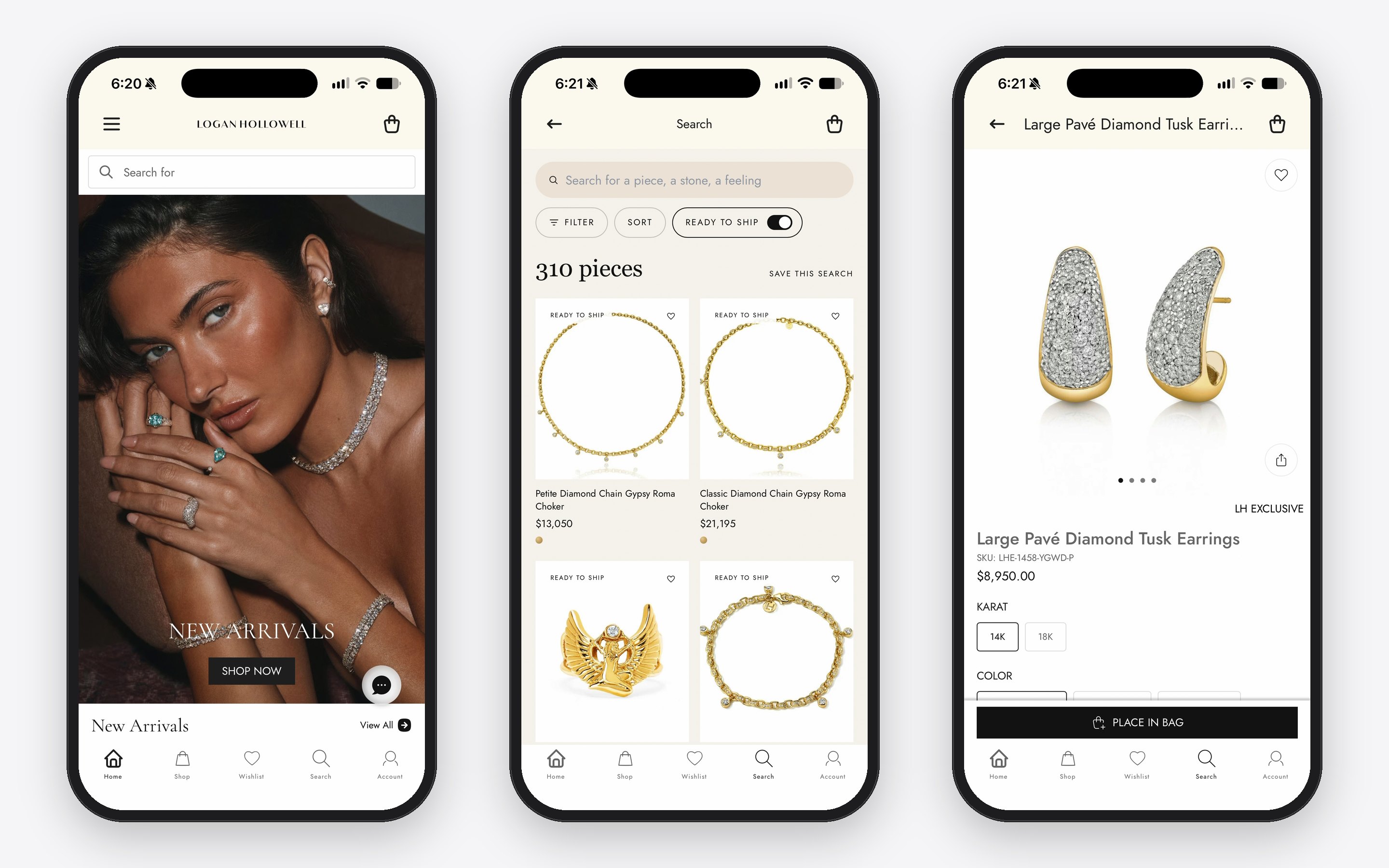
Logan Hollowell app on iPhone: the home screen, Search with Ready to Ship on, and a product page
The live app: the home screen, Search with Ready to Ship on, and a product page

Who built what

Tapcart

The platform Logan Hollowell uses to build and market its app. Its standard blocks cover navigation, the cart, checkout, collection pages and push notifications.

I designed and coded

Search and filters, the Ready to Ship toggle, Zodiac Signs Guide, The Aura Page, and production timeline on product page.

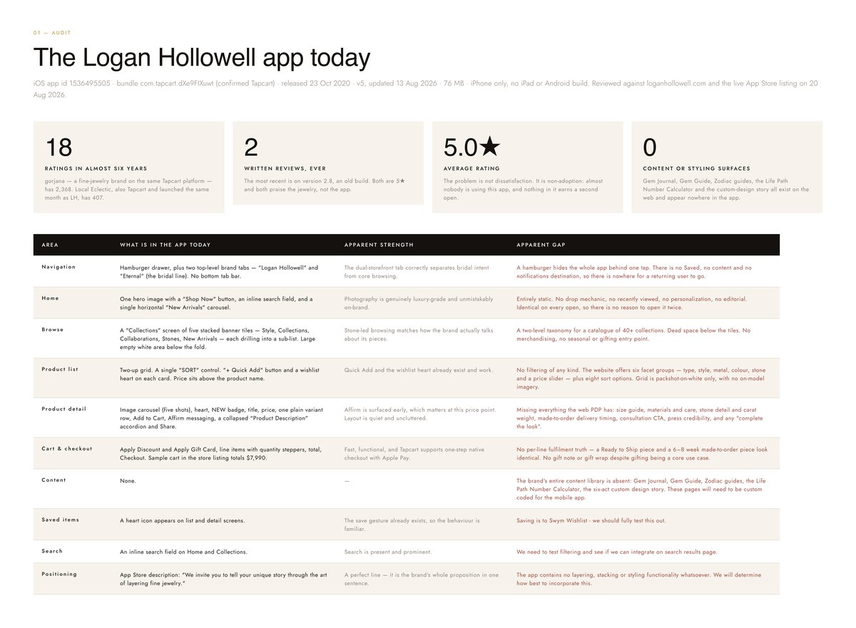
Five stars, and almost nobody using it.

The app had a 5.0 rating from 18 ratings in almost six years. People weren’t unhappy with the app. They just weren’t using it.

  • Missing

    No filters

    The website has six filter groups. The app had a single Sort.

  • Missing

    No delivery truth

    A Ready to Ship piece and a made-to-order piece looked the same.

  • Missing

    None of the brand’s stories

    The gem guide, the zodiac guides and The Aura lived only on the website.

The audit in Figma: four headline numbers, then a table of each area of the app with what it had, its strength and its gap
The audit in Figma: each area of the app, its strength, and its gap

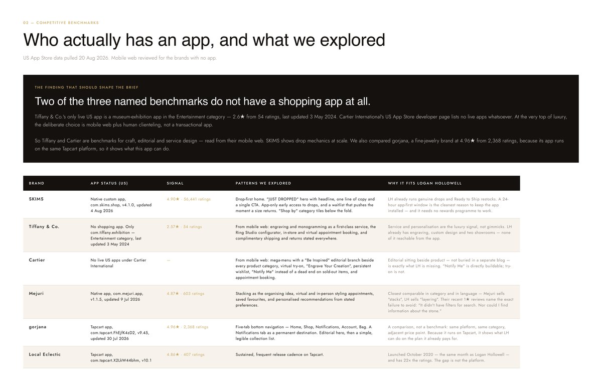
Two of the three luxury benchmarks have no shopping app.

Tiffany’s only US app is a museum exhibition app, and Cartier has none. At the top of luxury, the choice is the mobile website plus real people. We also compared gorjana, because its app is built on the same platform, Tapcart, so it showed what this app could do.

Mejuri

Their own one-star reviews named the failure to avoid: no filters for search, and no information about the stone.

gorjana

We explored their bottom navigation, with a permanent place for returning shoppers, an editorial hero, then a simple collection list.

Competitive benchmarks in Figma: SKIMS, Tiffany, Cartier, Mejuri, gorjana and Local Eclectic, with app status, ratings and the patterns explored in each
Benchmarks: six brands, their app status, and the patterns explored in each

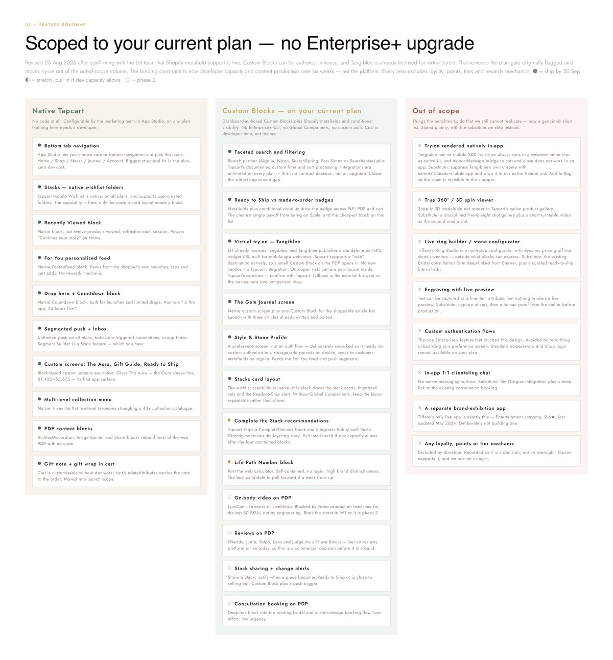
Every feature sorted by what it takes to build.

I split the roadmap into three columns: what Tapcart does without code, what needs a custom block, and what is out of scope, each with the substitute we would ship instead. Loyalty points and tiers were left out on purpose.

Feature roadmap in Figma, in three columns: Native Tapcart, Custom Blocks, and Out of scope
The roadmap: native Tapcart, custom blocks, and out of scope
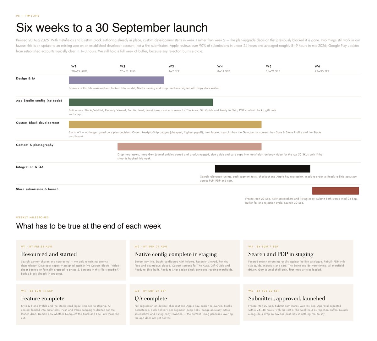
Timeline in Figma: six weekly workstreams, from design to app store submission, and what had to be true at the end of each week
The timeline: six weeks to a 30 September launch, with a week held for app store review
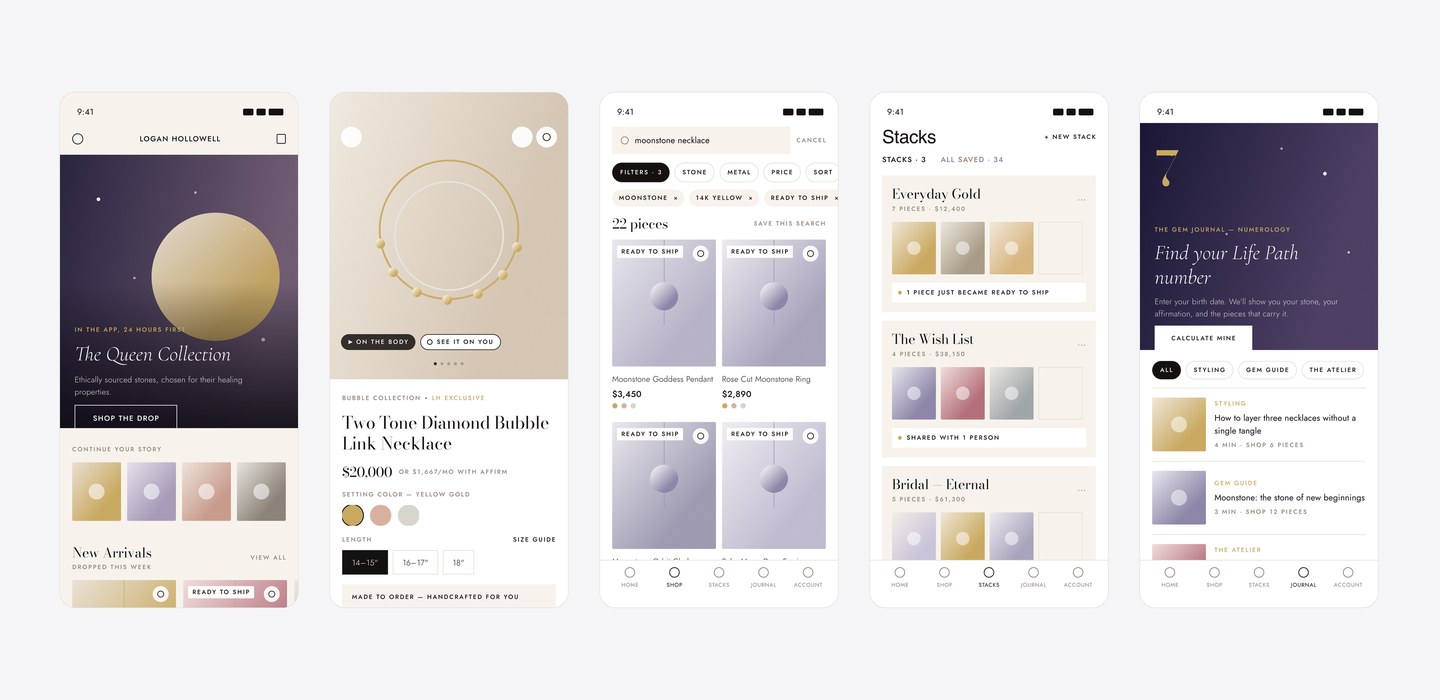
Five redesigned app screens in Figma: Home, a product page, Search, Stacks and The Gem Journal
Screens in Figma: Home, product page, Search, Stacks, and The Gem Journal
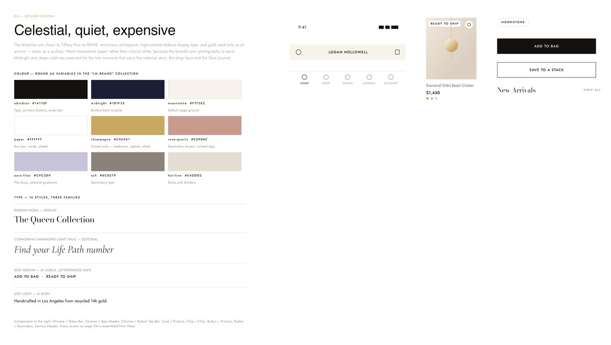
The app design system in Figma: nine brand colors, three type families, and the header, tab bar, product card, filter chip and button components
The design system: colors as variables, three type families, and the components every screen is built from

Five features, designed in Figma and coded into the app.

Decision 01

Search shows the catalog before you type.

An empty search box browses every piece, so filters and real counts are there from the first tap: stone, metal, category, color and price.

Why

People often arrive knowing a stone or a budget, not a product name. The plan called for a paid search partner. Shopify’s Storefront API already returned the filters and counts we needed, so I built search on it directly: no contract, and the counts always match the store.
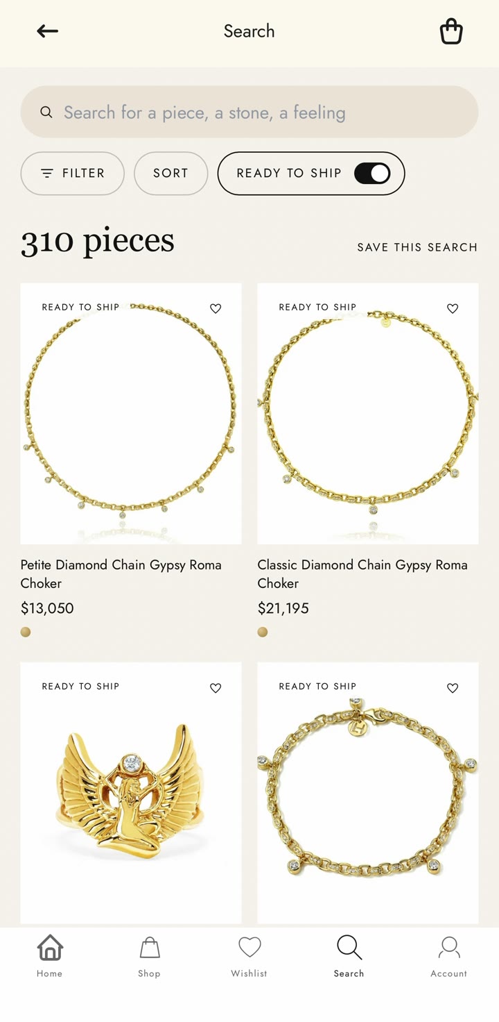
Video · Search, the filter panel, then the Ready to Ship toggle turned on
Decision 02

Ready to Ship is a toggle, not a button.

One tap narrows the results to pieces that arrive in two to four business days, and the count updates with it.

Why

My first version was a filled pill, and people read it as a filter that was already on. A toggle says on or off without anyone having to guess. It sits beside Filter and Sort, not inside the panel, because for a gift buyer the delivery date comes before stone or metal.

Search with the Ready to Ship toggle on, showing 310 pieces
Ready to Ship on: the count drops from 664 pieces to 310
Decision 03

Zodiac Signs Guide, on one screen.

The website’s Written in the Stars page, rebuilt for the app. Enter a birthday to reveal your sign, or browse all twelve. Each sign shows its dates and stone, and opens its collection.

Why

People already shop this brand by zodiac sign on the website. On the site it is three sections on a long page. On a phone, the finder and the twelve signs work better together on one screen.

Video · From Home into the Zodiac Signs Guide
Decision 04

The product page says how a piece arrives.

Above the buy button, every piece says whether it is made to order, with delivery in four to six weeks, or ready to ship. Details, inspiration, care, sizing and shipping sit in sections that match the website.

Why

The same lesson as the website: a lead time found at checkout reads as a delay. Shown next to the price, it explains the price.

Video · A made-to-order piece, then the details sections
Decision 05

The Aura Page, a story inside a shopping app.

The Aura page brings the brand story into the app: a full-width hero, Logan’s own words, then the live Aura collection to shop.

Why

On the website the hero is a looping video. In the app I used a still frame, because it loads faster inside the app and matches how the other Home banners are built.

Code inside the app has rules the design file doesn’t show.

Each one showed up on a real device, not in the design file.

  • Panels open in place

    Overlays fixed to the screen were cut off by the app’s block container, so the filter panel opens inline, in the flow of the page.

  • 16 pixels is the smallest input text

    Anything smaller and iOS zooms the screen when the field is focused.

  • Use the app’s own navigation

    Pieces and collections open through Tapcart’s own actions, so custom screens behave like the rest of the app, including the back button.